Mumbai Indians Website & Apps

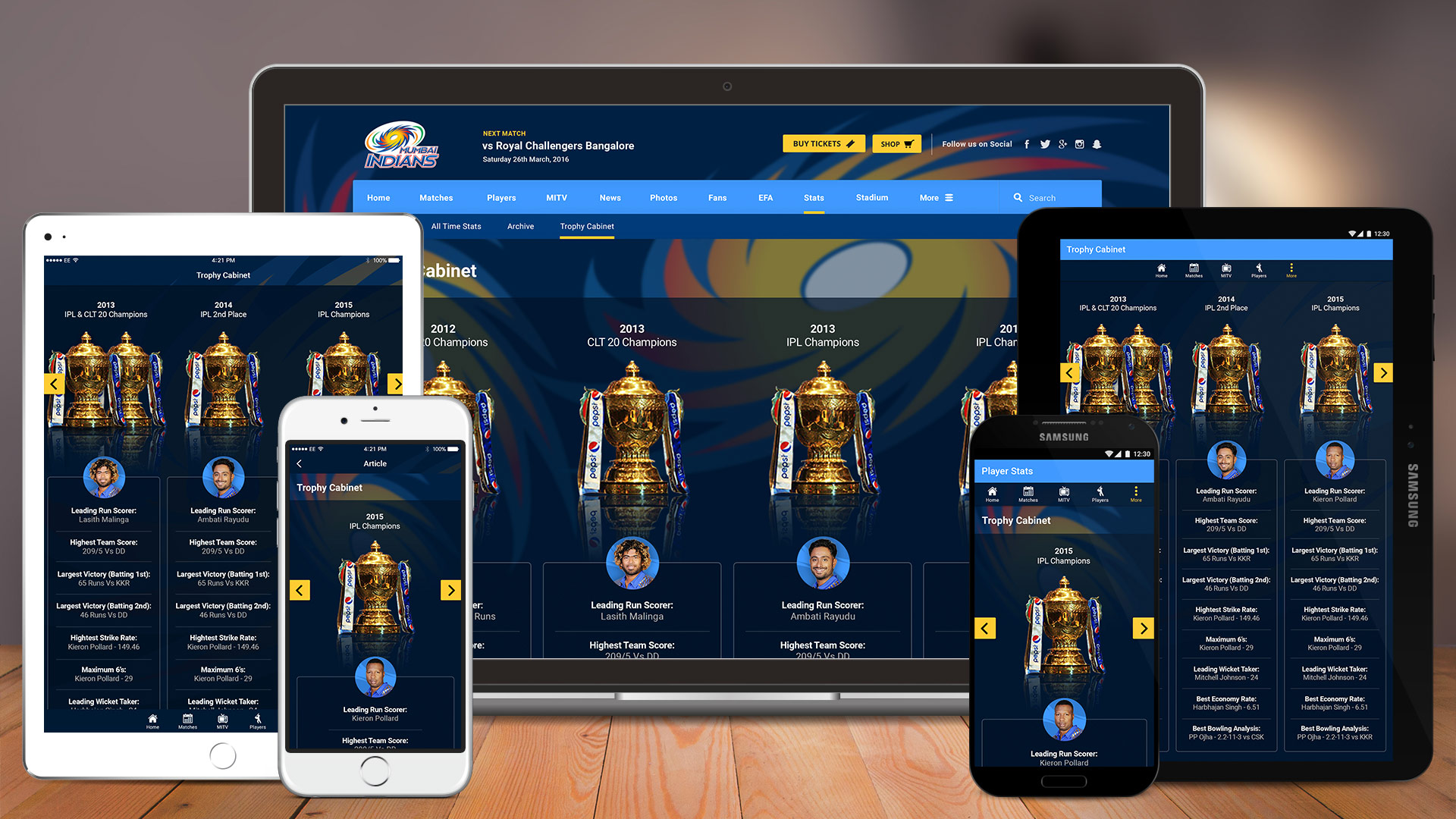
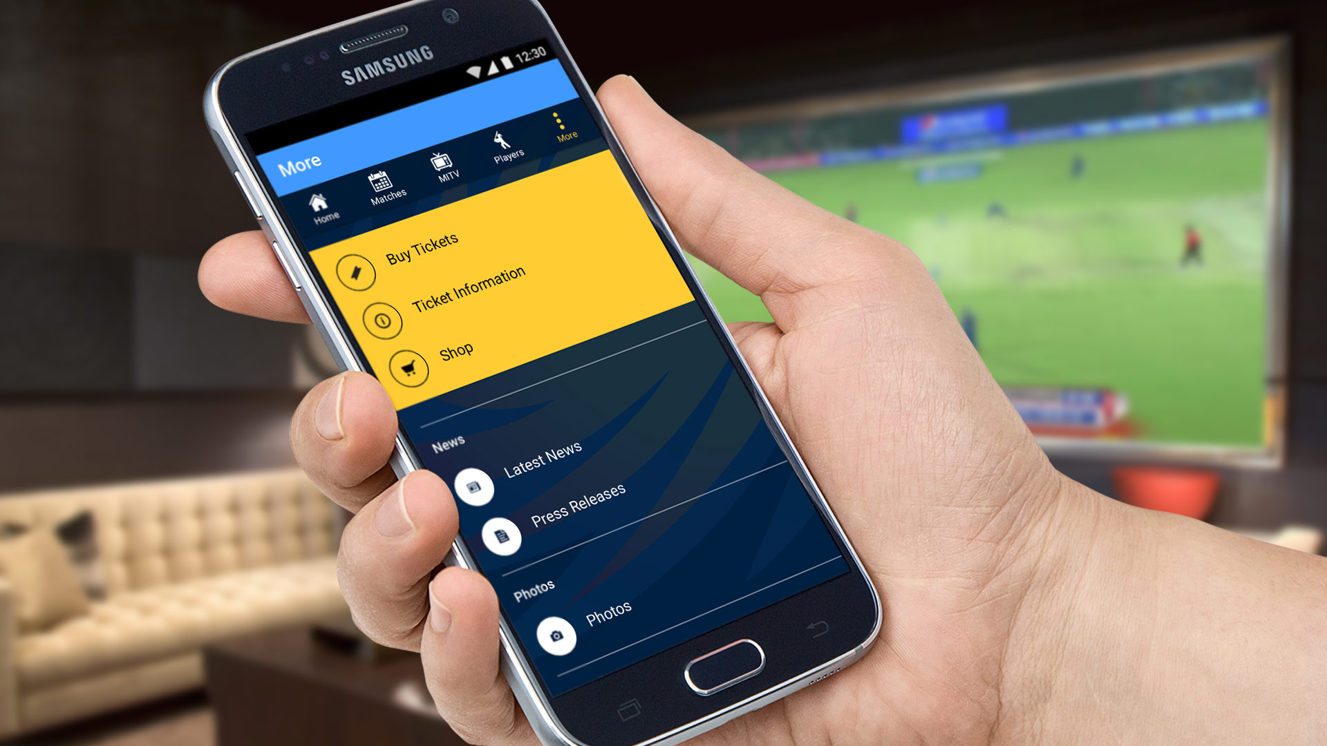
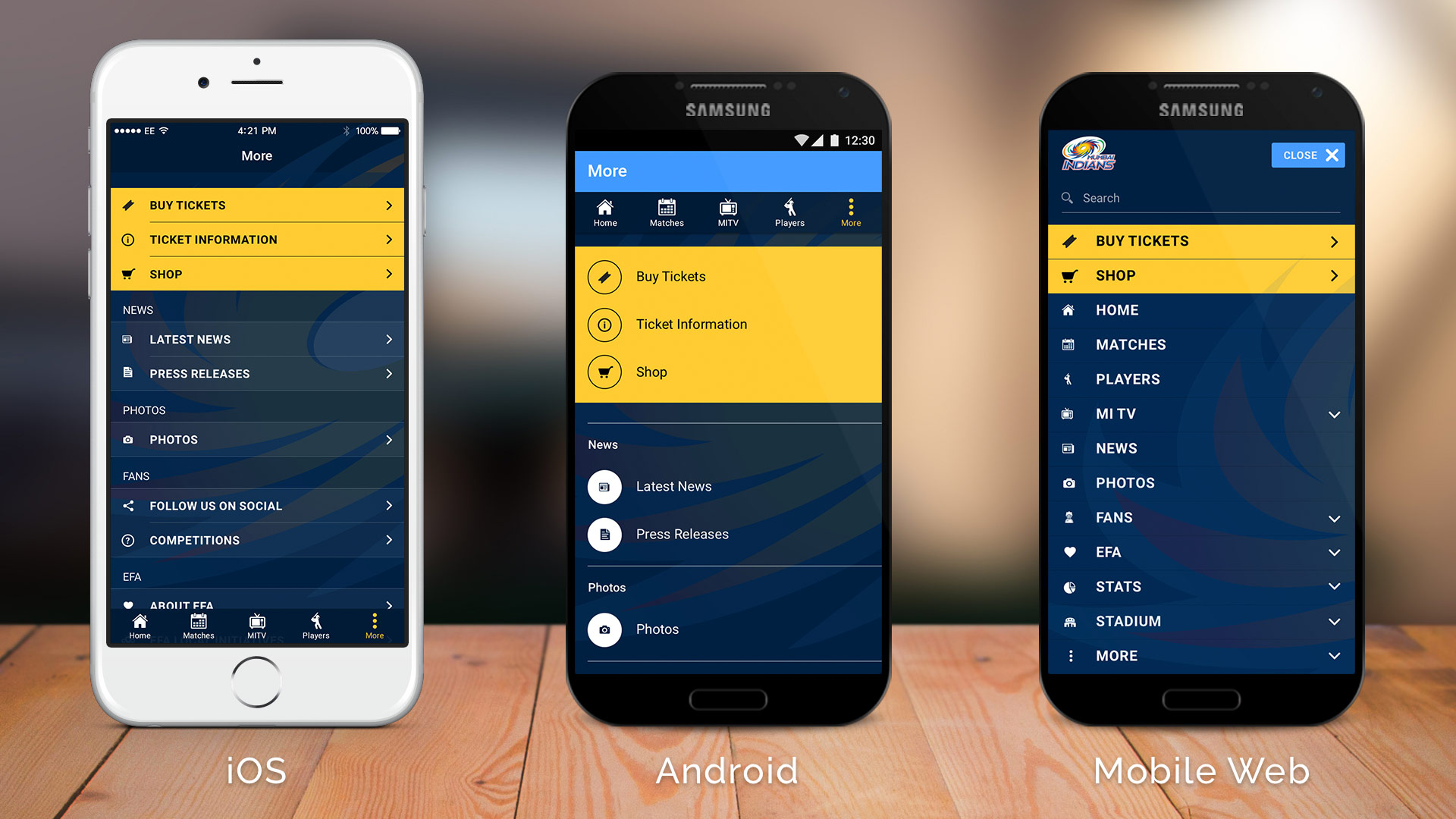
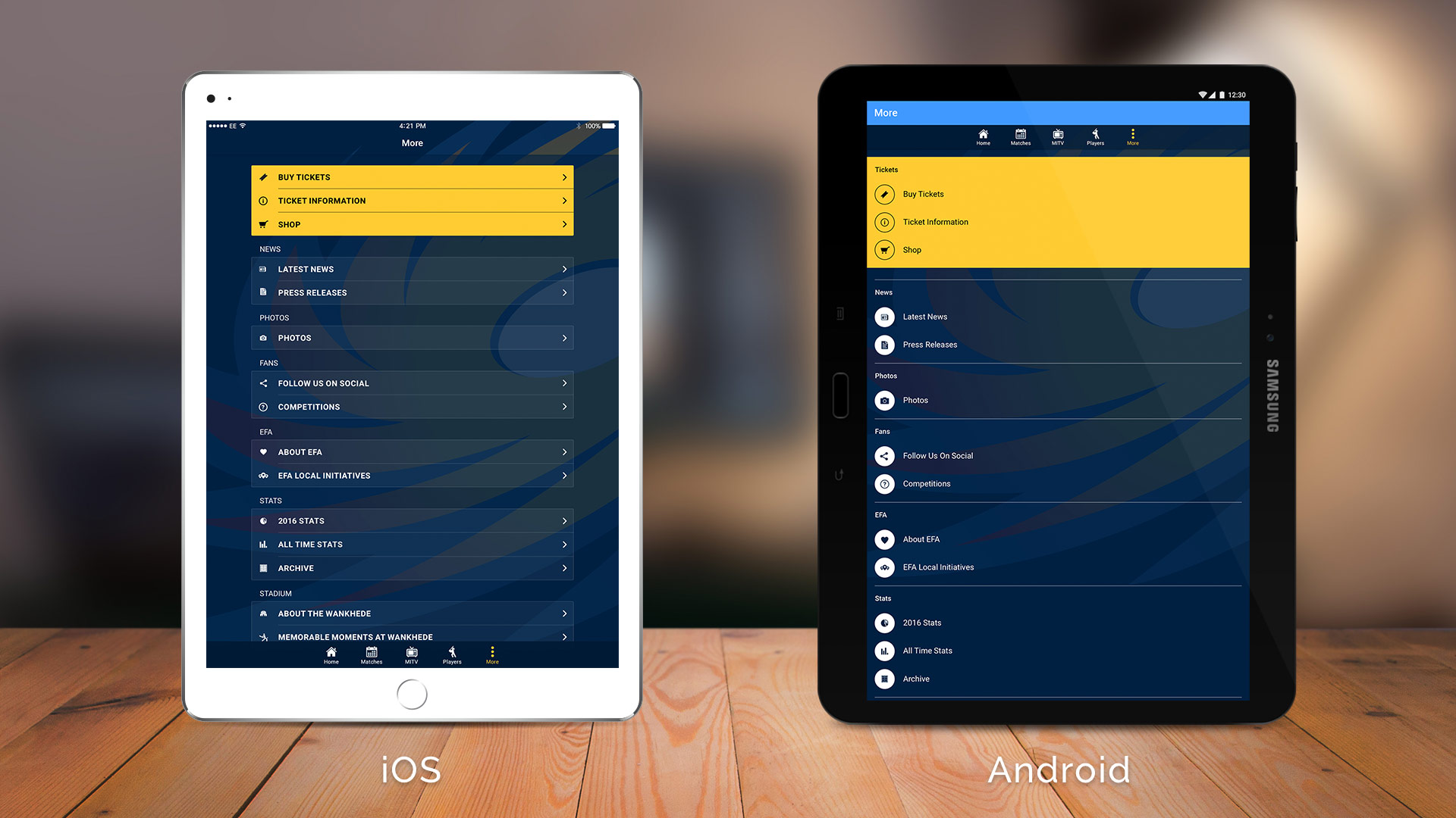
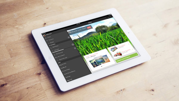
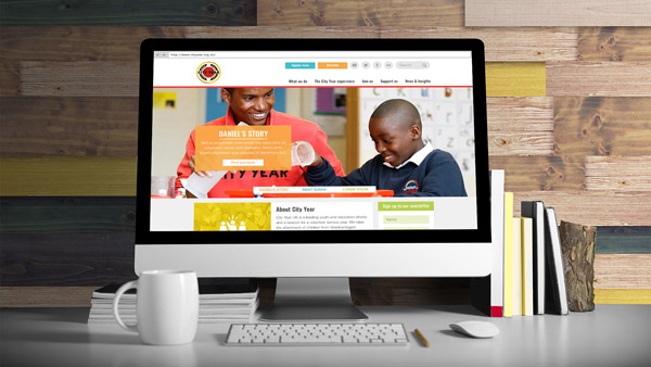
A design to suit all screens and platforms

Designing for the web is not the same as designing for Android or for iOS. There are different guidelines for each platform and users are only familiar with their Operating System of choice.

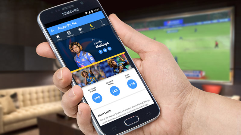
I was tasked with reformatting the Mumbai Indians website to work across all platforms and to keep all of their users happy.

Below shows how I used best practice and user interface guidelines to navigate the differences between each Operating System and screen size has to create a user experience which suited all target audiences.

During this project I worked across web (desktop, tablet and mobile), iOS (mobile and tablet) and Android (mobile and tablet).

Devices_1920x1080_trophy-cabinet
MI-cover_1920x1080_more
Devices_1920x1080_mobile-devices
Devices_1920x1080_tablet-devices

City Year Website

After discussions with the client we established what the target audiences were and what their goals were. From this four personas were created as reference points for use throughout the project.

CityYear_Sitemap_v1.0_Neutral2

Now we knew who we were designing for, restructuring the information architecture of the site could begin. A number of example user journeys initiated with these personas in mind were created to help us get a feel of how they might interact with the site, and presented to show the client how we could help each user to achieve their goals.

From here we knew a relatively large site was needed and that it was to be content managed, and the wireframing process began. The layout was subsequently approached with reusable templates and modules in mind, and various bespoke user journeys and UI for important parts of the site (such as the sign-up process) were also created. Prototyping software (InVision) was used to create an interactive demo of the site which was then presented to the client, as well as the developer later on in the project.

Next the team started work on the visual design. In line with branding guidelines supplied by the client we made the most of their vibrant, positive colours to appeal to the younger audience, as well as to parents looking to apply on their behalf. The layout was kept clear and practical, with Google Material Design style content blocks used to break the page up into easily digestible chunks.

I also worked with the development team to discuss the build of the site and the CMS. I created animated videos in Adobe After Effects to demonstrate how the more complex UI elements would work.


And, of course, given the target audiences, the site needed to be completely usable on screens of all sizes.

iPhone6_CityYear

The new site has resulted in a positive response from users, as well as a happier marketing team who are regularly monitoring and updating the site through its CMS (WordPress).

< Back to portfolio

Contact

Get in touch