During my time at Common Agency we were tasked with a complete redesign and build of the Photobox iOS apps. Working closely with the UX team, I was in charge of UI, Visual Design and Art Direction.
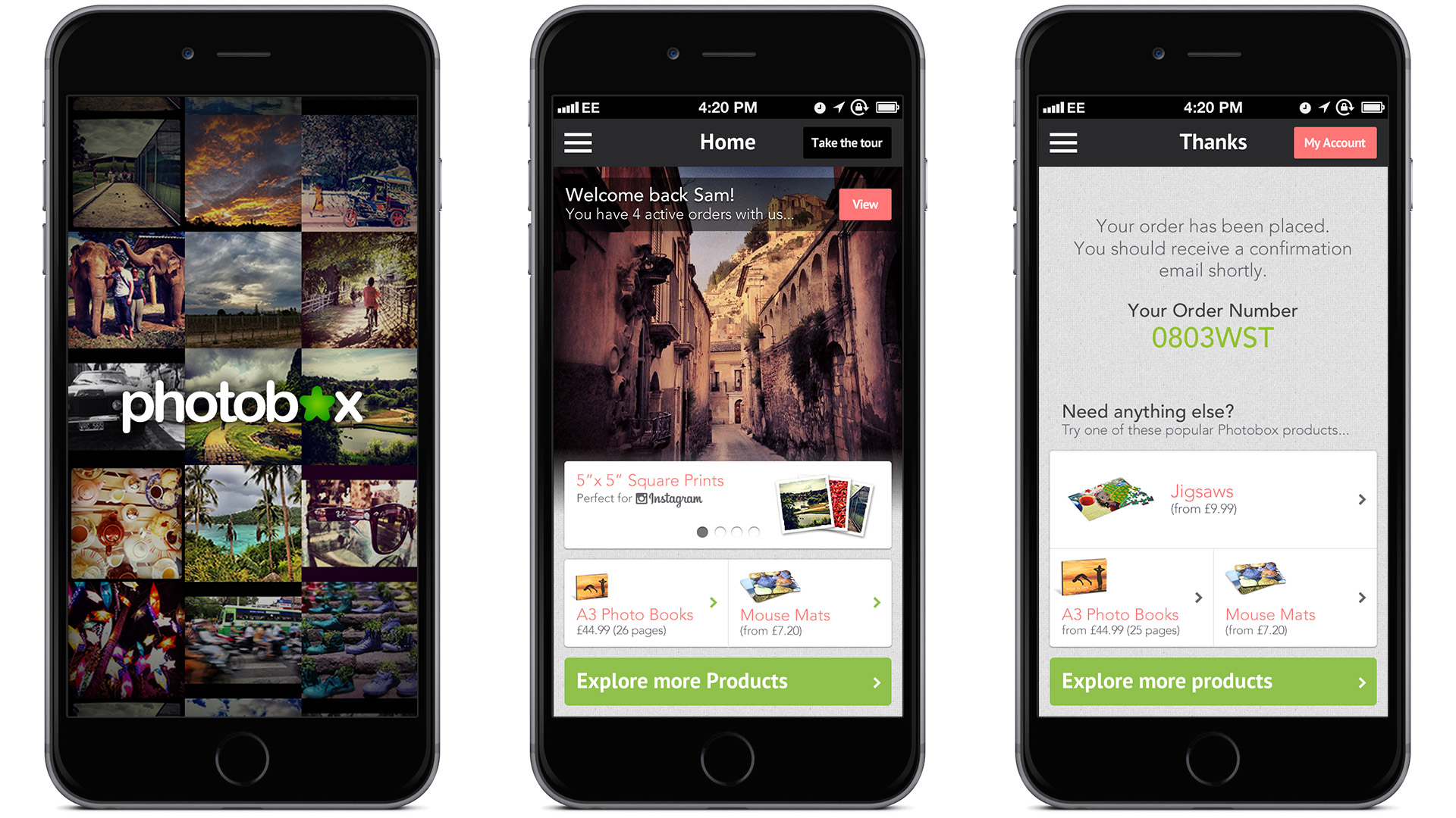
As Photobox are all about personalising products with photos from the individual, I wanted the first screen seen by users to showcase photos from their own device.
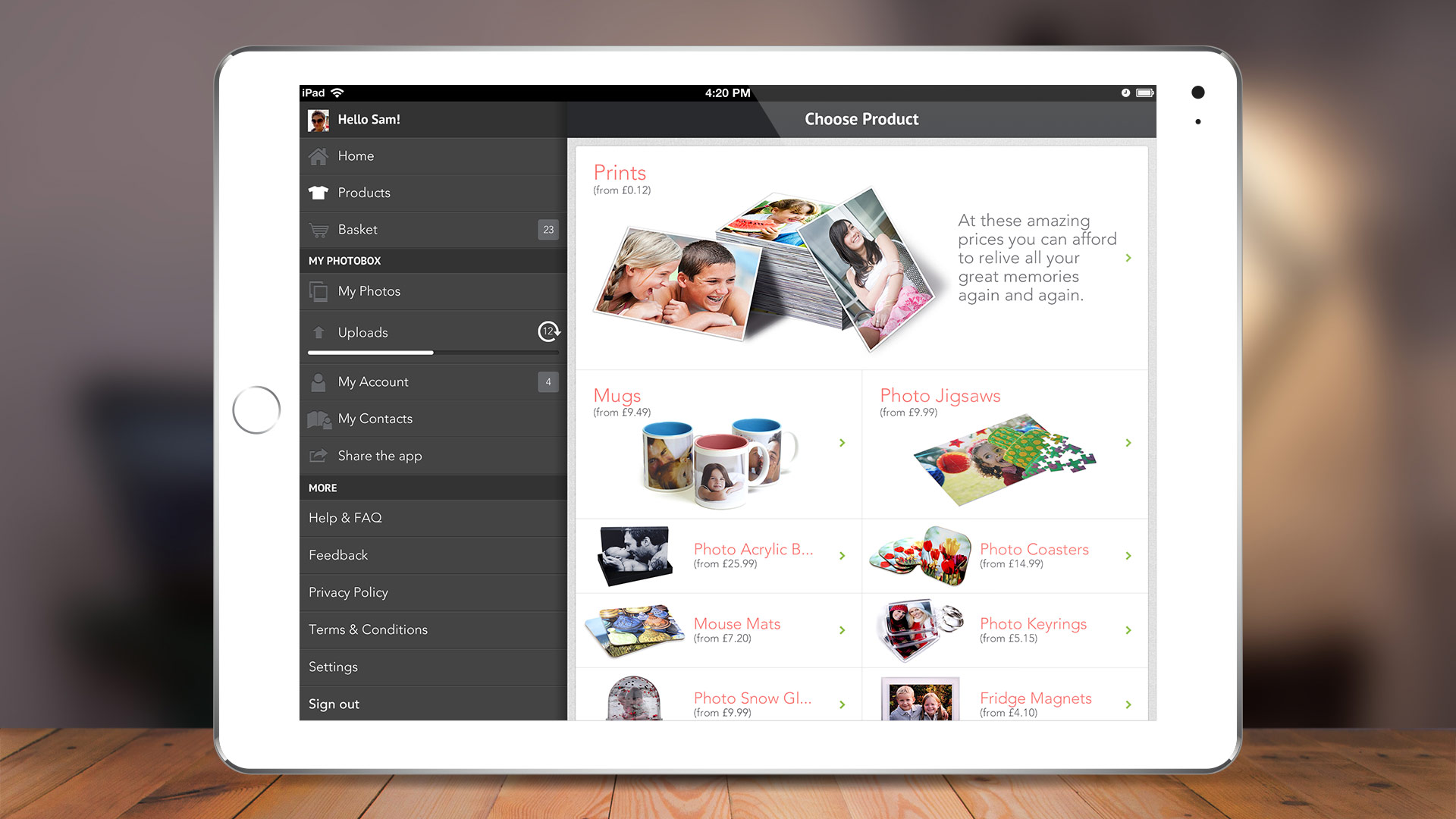
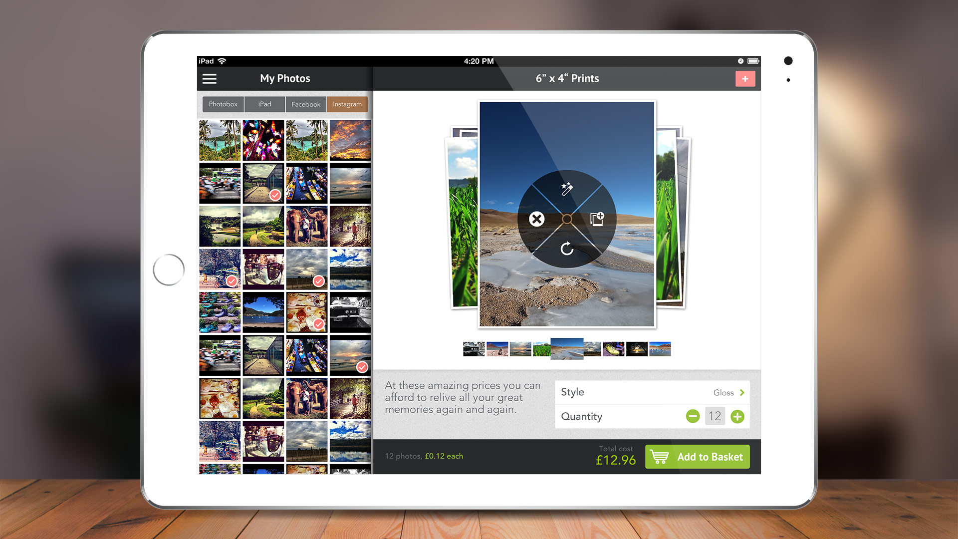
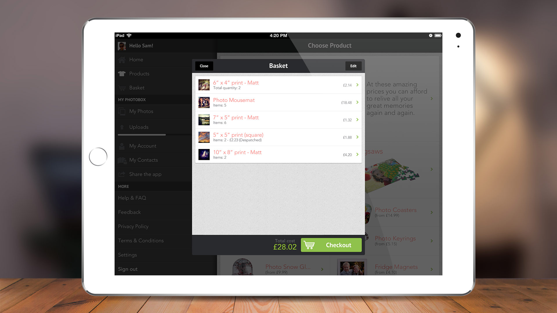
I chose two main brand colours and used them consistently throughout the app to create familiarity for users. Green was used for every main CTA, and coral for all secondary CTAs.

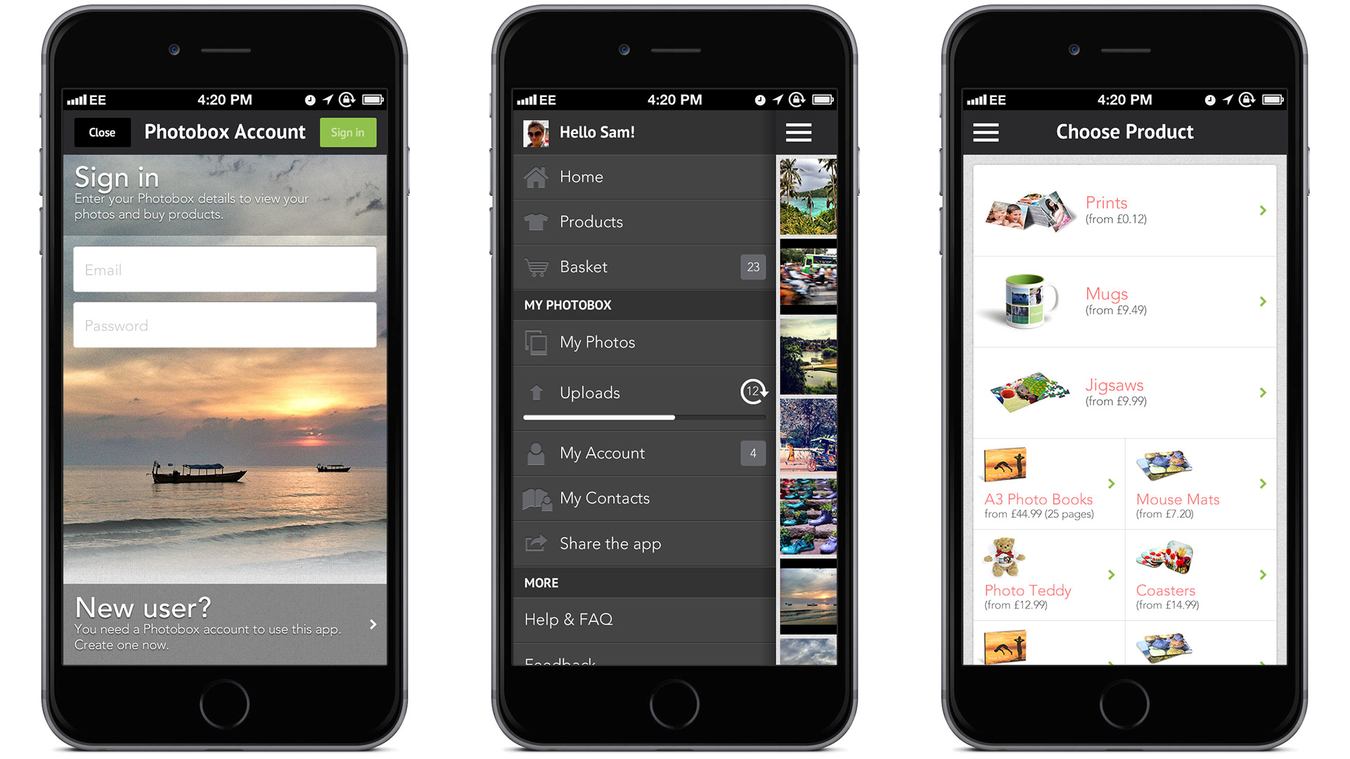
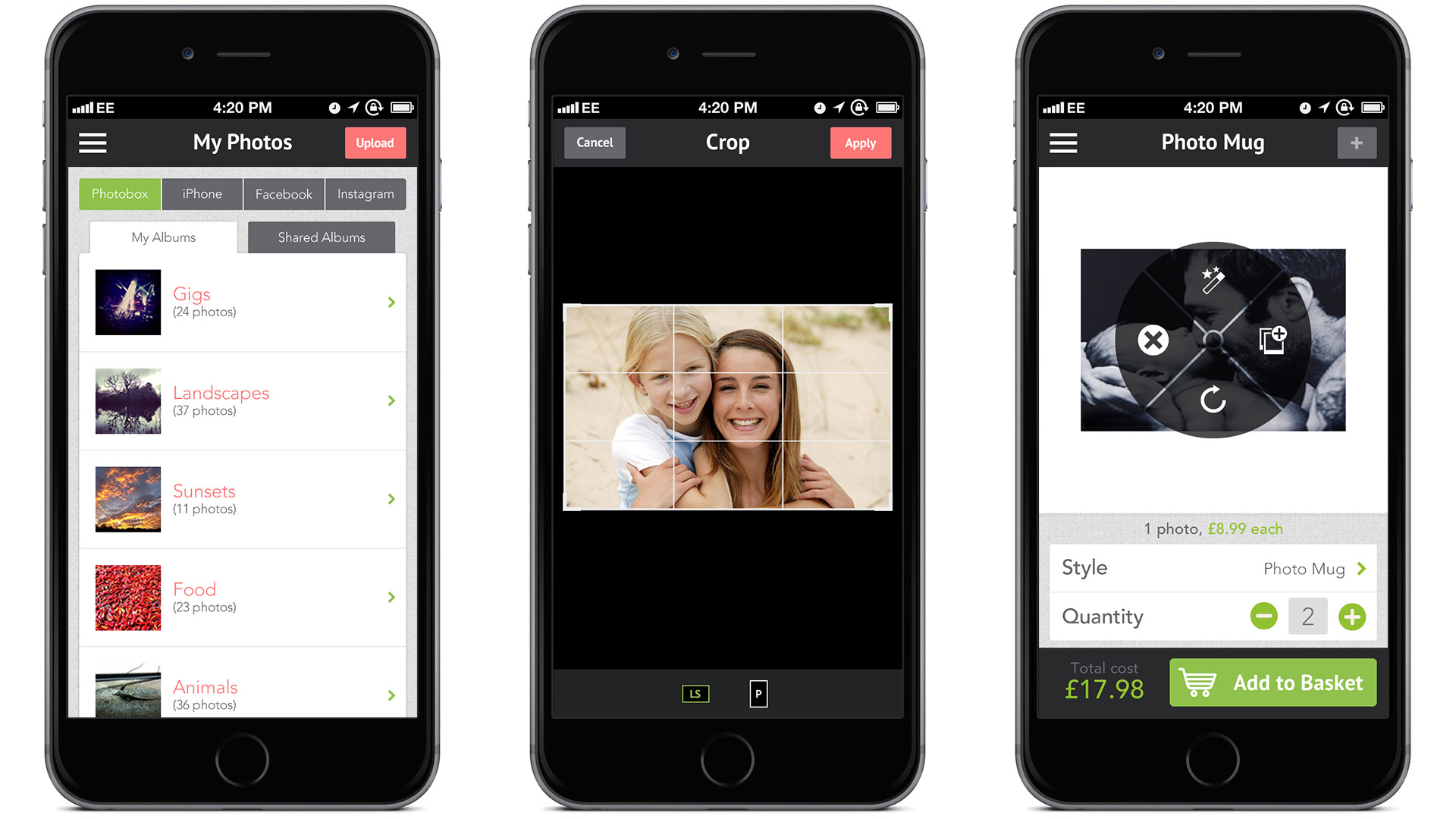
I used native iOS UI wherever common tasks such as navigation and forms were needed, but Photobox was a large app with sometimes complex and bespoke tasks, so it was a fun and interesting challenge designing the intricate interfaces for these parts of the user journey.
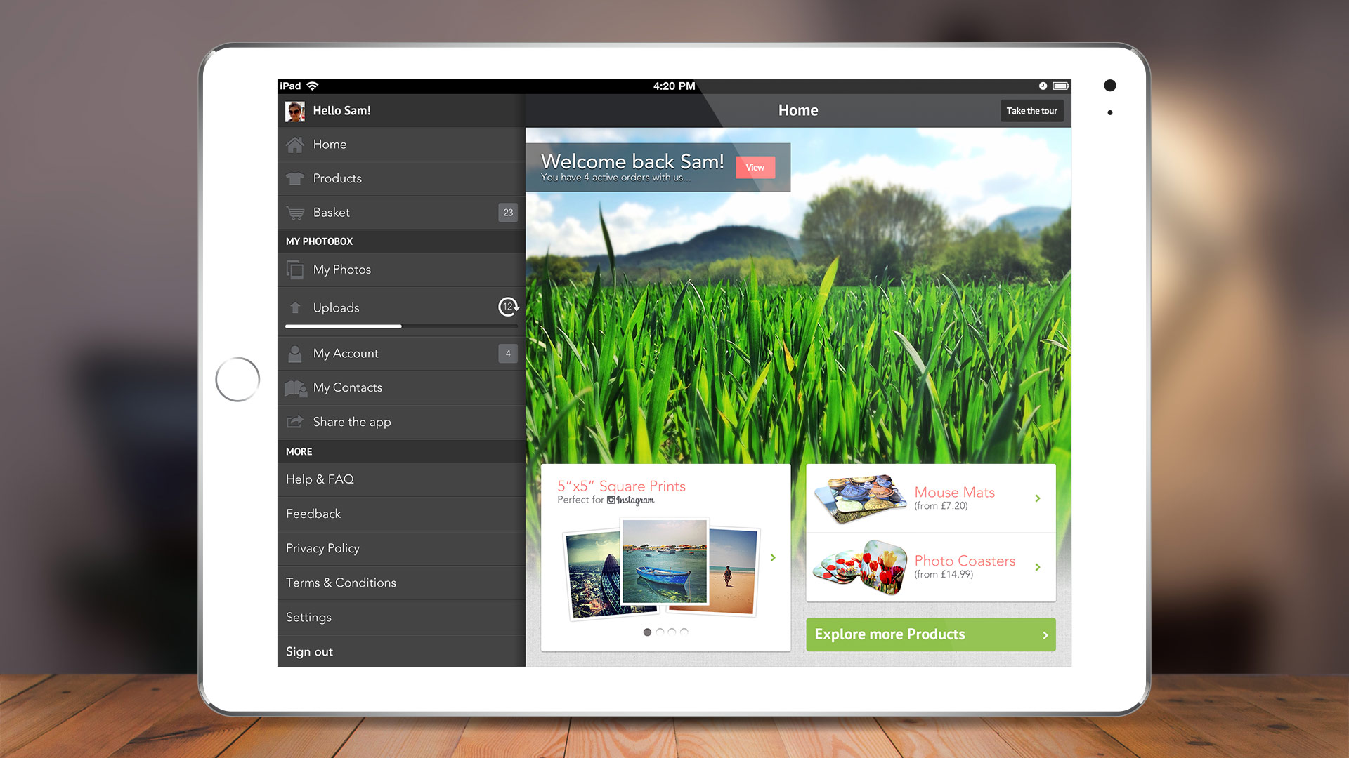
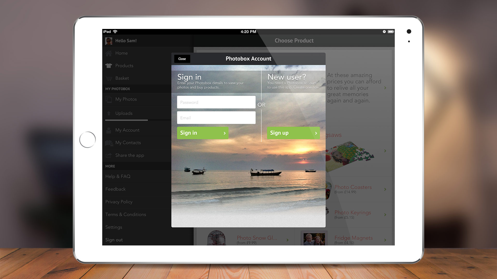
As the iPhone app developed we were mindful of how this would work on the larger iPad screen. I subsequently created the navigation in a way that could be reproduced on iPad, as well as certain focused tasks such as logging in which were displayed on the iPad in a modal window which meant it was designed at a similar size to the mobile, and did not take away from the user experience.
I tried to create useful microinteractions wherever possible, such as the uploading progress bar in the navigation area.
Below are a selection of iPad screens which demonstrate the points highlighted above. Some of my own photography was also used when the app went live, including the shots on the homepage and login screens.
< Back to portfolio
Photobox App Design January 24th, 2018samwell
